
I am currently working on an overhaul of Episodes main interface. As a Mac developer, you need to pay attention to the small things. This is what a good App makes a great App.
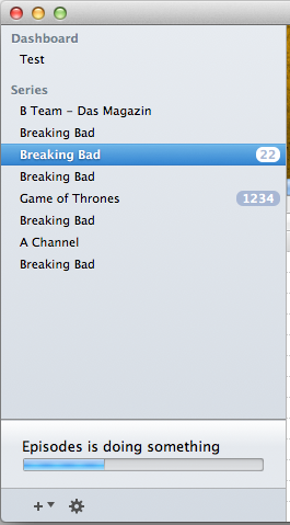
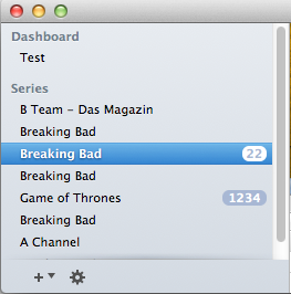
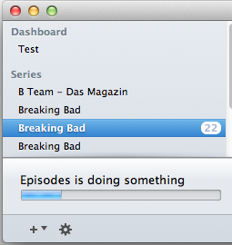
In the last days, I’ve spent several hours in reworking the small view on the lower left which indicates that Episodes is doing some tasks in the background. This is how its looking in current version:
Its okay, but its not great. The expand/collapse animation was a bit buggy as well as the progress indication itself. To improve the visual appeal I decided to invest some hours to make it perfect. This is the result. My goal was to let it look like its “below” the surrounding interface. I’ve also added an animation which “slides away” the concealing panel.
In the next iteration of Episodes i’m going for a borderless interface, which leads to some problems.
What happens if the list is getting longer or the user resizes the window? A scrollbar will become visible with its bottom end hanging loose in the air. It would look pretty bad. My solution is to slowly fade in a shadow to distinguish the list from the bottom menu.
This makes it a lot better. Apple uses the same approach e.G. in Apple Mail and its great, but its not yet in the framework so each developer has to implement it them self and most people are doing it only half-assed.
But thats only half the deal. What happens if the progress-panel slides in? The gradients and shadows have to match in this combination also.
These are the small things which need a lot of work to make them right. Most people won’t even notice any of then. But they would, if things would look bad. Its makes an App better, as the User feels better when he uses it.